When I first walked into the Smith Center, I was blow away by how beautiful everything was. Art Deco is my one of my favorite visual arts designs, so all I wanted to do was come back with my D80 and just take pictures for days.
Just look at that lobby! It's like visiting the Hoover Dam without the drive! It feels like you need to be dressed up to step foot on the marble walkways and grace the amazing walls with your presence.
I won tickets, so I got to sit in one of the box seats for the performance I was attending. The inside is designed sort of like an old style opera house, and the box seats are designed like they were in the old days. Where you are meant to be seen, and not to see the show. We had to pull our chairs out and set them up so that we were facing the stage.
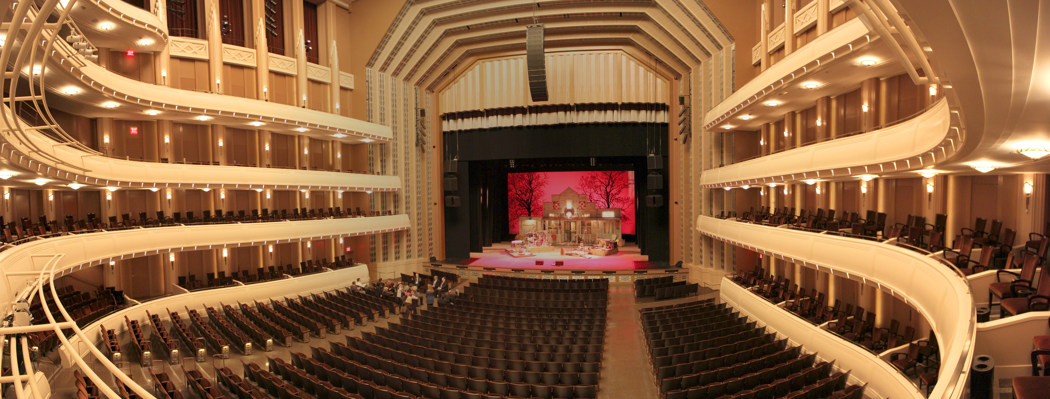
The show itself was first rate, but I was so upset when I saw how the stage was set up. At first glance it doesn't look so bad;
But when you think "what if I was in the balcony in the front row?"
Kinda far huh? It looks further without the Fisheye lens too. It confounded me why you would build a brand new theater that was so poorly designed as far as seating. Maybe I'm too used to Cirque designing my theater, so that there is never a bad seat to be had. I'm sure they want to make as much money as possible to pay for the building of this epic building.
But unless I win good tickets, I'll never pay to "not" see anything in that theater. It's a big, beautiful shame.
3 hours ago


No comments:
Post a Comment